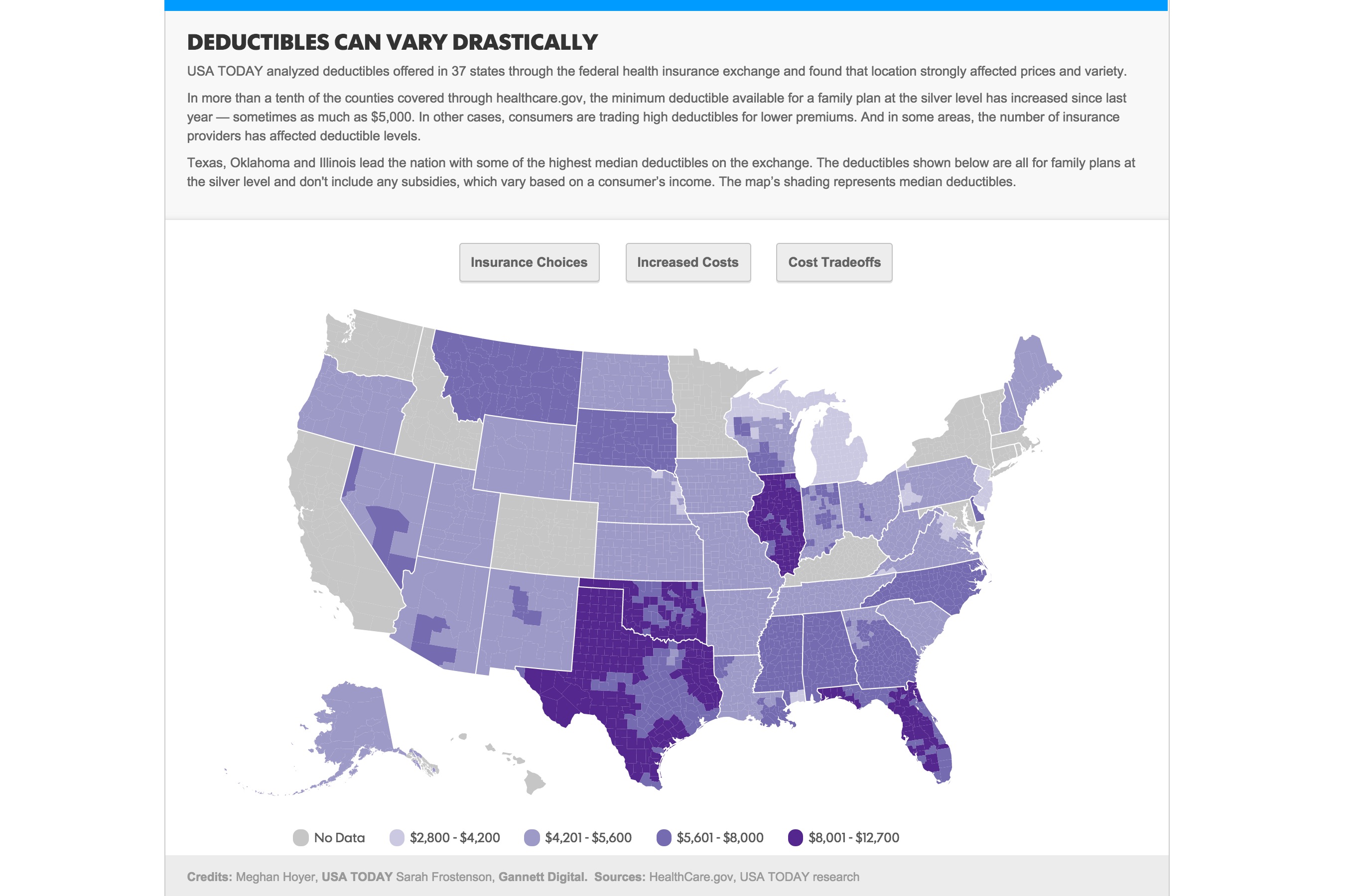
Mapping Affordable Health Care Data
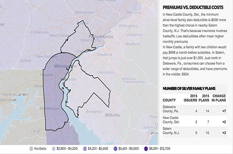
Using Affordable Health Care plan data from 2015, I worked with Meghan Hoyer to visualize disparity in deductible premiums for the silver family plan. I used D3 for the national view of the map and using D3 transitions, I switched to a Mapbox baselayer for our three case studies, or zoomed in views. I used Python to clean and simplify the spreadsheet data and a Makefile to bind my csv data to my topojson. Read the full story and explore the interactive.
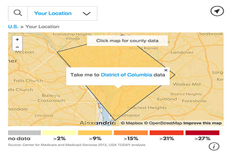
Additionally, I updated the USA Today interactive on Affordable Health Care plan data with 2015 data, calculating the change from 2014. I used backbone.js and Mapbox and Leaflet. Read the full story and explore the interactive.